
Good website design is often misunderstood. Sometimes a business sees the practice as secondary to the rest of their brand, other times they can throw proper website design principles out of the window in favour of trendy, over-designed aesthetics.
We always opt for audits when starting client relationships. Most audits show that the businesses we work with aren’t making the most out of WordPress. They rely too much on plugins and neglect some key design principles.
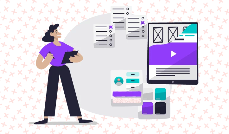
At Illustrate Digital, we conduct our WordPress site audits with our own 10 commandments of good website design in mind. Below, we break down these commandments. We see what they mean for you, their relevance to hitting briefs, catching up to competitors and achieving success with the platform.
1. Consider usability and accessibility
Your website might look good enough to quickly hook users in, but if it’s difficult to use, doesn’t focus on the user’s needs and doesn’t provide a low barrier of entry for a wide range of individuals, then it will drive them away just as fast. Our audits focus on whether your customers can achieve the website’s end goal and that you’re suiting their needs.
It’s an area not to underestimate. The last thing you need is for your users to get lost and think too much about where to go. It should all feel natural. Usability (customer experience mixed with user experience) is what ultimately decides whether a website succeeds or fails. So this commandment is on our mind from start to finish.
Accessibility plays a key part in this and it can be easy to associate this with ‘disability’. In reality, accessibility is a much deeper subject and centres around ‘access’. Can your intended audience access what they need to, as quickly and as easily as possible?
Our initial review of usability and accessibility exists so we can make actionable changes that drive results.
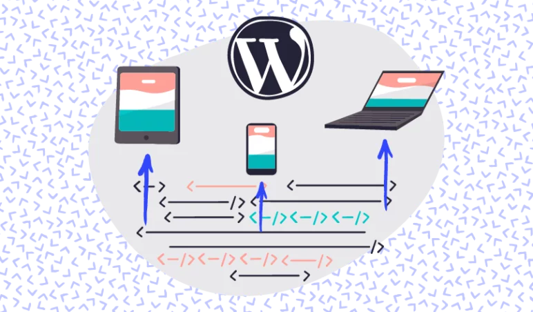
2. Focus foremost on mobile
Mobile usability is a huge part of UX design and has been for a number of years; the majority of Google searches worldwide come from mobile devices. Our initial focus on usability includes mobile for that reason, with our fresh set of eyes evaluating your site based off your target market.
If your website only works on a computer and does not adapt to mobile, then you are effectively cutting your possible customer base in half. By investing in device-agnostic design, you can ensure your website will work on any device, anywhere.
The temptation by many agencies and designers is to develop based on the screen they’re looking at. This is almost always a desktop or laptop computer. The temptation must be resisted though and going back to commandment number one the focus must be placed on what’s best for the user.
3. Keep things simple
As a rule of thumb, we are against bloating a website with unnecessary plug-ins and over-designed elements. Keeping things simple not only has benefits for usability, but it reinforces the purpose of your website.
Having a user that is aware of what you do and where to convert is better than a user who is initially impressed but eventually becomes confused. Or worse, a user who is confused from their first impression.
When someone wants to make the choice to enquire or purchase from you, but find it difficult to make that next step because it’s not obvious, then a considerable opportunity for simplicity is missed.
Cutting down on unnecessary plug-ins and unnecessary elements of design will improve site speed. This is an essential bi-product of simplicity. We’re not aiming for a boring experience but unnecessary isn’t, well, necessary.
4. Keep note of colour theory and imagery
You want the colours of your website to reinforce the messaging of your brand and hit the right emotive points, also ensuring it keeps your website readable. Looking at contrast, complementation and tone is important, but so is the type of imagery your website is using.
Images should fall into a visual hierarchy that makes sense. A visual hierarchy should arrange elements of your website in order of importance. This is determined by size, style, colour, image type and so on. The main aspect you want to achieve when looking at a visual hierarchy is a focal point – this is where the essential information or a sense of purpose that you want your customers to see is.
Above this, connecting with your audience through your use of imagery and colour is a strong communication tool. It will help them feel at ease and let them know you’ve considered them in the creation process.
During our website audits, we benchmark against basic design principles of colour theory and imagery to see if improvements can be made. Colours, imagery and graphics should be there to enhance the user journey and experience, not distract from it.
5. Remember to prop the hood up
Good web presence isn’t solely about what you see. Tidying up and optimising image sizes, condensing HTML, JavaScript and CSS, optimising hosting setup and rectifying the misuse of plug-ins all benefit your website platform by trimming down on load times and improving user experience.
We use our technical expertise to review a website’s backend and technical architecture. Via a thorough tech audit we can pinpoint key mistakes, vulnerabilities and performance issues. This way we can make an action plan to fix these, speed up your site and make sure challenges aren’t repeated over time.
A fast, fluid website sends strong trust signals to your target market, whereas a slower load time turns users cold. Google, as a perfect example, update their stats around this on a regular basis and are pretty tough in their approach to ideal site speeds. As of 2019 they recommend a 2 second load time on an average site. This is a lot to ask for depending on the site setup, but we couldn’t exactly say they’re wrong.
6. Consistency and cohesion
A memorable website is always stylistically consistent across pages. Achieving cohesion is difficult, as the business goals alone can throw one or two pages off and degrade the consistency of the entire site. To achieve cohesion, you need to sweat the small stuff: text size, font, heading usage, imagery type, page structure, types of images, etc.
Not every page needs to be exactly the same, but by having each page consistent in a few key ways makes it feel like a consistent package. This is instead of the feeling that a few pages have been cobbled together. For example, we manage to achieve stylistic cohesion for our clients by using visual mock-ups, allowing us to provide an accurate representation of how the site will look, as well as providing a space to edit and standardise fonts, colours, etc.
There’s of course a big difference between consistently bad and consistently good. If you’re working to improve your site section-by-section, then of course it’s better to have a couple of better pages than to wait for the whole site to be completely redesigned and redeveloped.
In ‘modern web’ there should be an acceptance of evolutionary design and development. Not looking to the revolutionary, major overhaul method that was once the only viable way to improve.
7. Refine Your navigation
The structure of your website and its pages should follow a logical hierarchy to funnel users exactly where you want them to go.
Website navigation is a multifaceted process, but its focus is simply making sure your visitors do not get confused. Look at your site map and work out how many clicks it takes a user to reach the pages you need them to get to. Remember that the logical route for you (someone who understands your business well) won’t be the same route that your customers will take. Asking whether certain pages need to exist and refining your use of calls to action helps to streamline your navigation, which is a desirable end result.
By having a navigation that streamlines your website without deleting the most important content is essential to get results. Not all pages need to be in the main navigation. It’s worth considering secondary or footer menus to house non-important content that should still be accessible.
8. Improve typography
Typography is a specific area of design with a lot of complexity, but to boil it down, you want text that is easy to read. You can go deeper and think about a font that reinforces the messaging and philosophy of your brand. Just remember that the most important aspect from a user’s perspective is its readability.
Unreadable or annoying fonts can make users bounce off the page, leading to negative effects on your SEO and conversions. Make sure font sizes are consistent across pages, too – alterations and a lack of font cohesion looks unprofessional and can curtail the performance of an otherwise good website.
9. Note the use of white space
White space is the reason why some websites look “clean”. Leaving a space between images, buttons and anything with strong visuals is important to make sure a page doesn’t feel cluttered.
White space, also known as negative space, is important to highlight focal points on a page. If an object has more white space around it, then it places itself further up the page’s visual hierarchy.
Information-heavy pages can often be cluttered, so spacing things out, trimming the word count and adding white space can change a website from an unreadable mess to a readable, breezy experience that funnels users.
You do not want to go over the top with white space though. If you are sacrificing meaningful content in favour of space, then something is going wrong. We use our design and WordPress knowledge to strike a balance in these situations, finding space for you and your users to breathe.
10. Use grids and structural wireframes
Grids and structural wireframes help to keep your website, well, structured. They can be used both onsite and in the planning/design stages, allowing you to see the whole picture and facilitate a structure that is both appealing to the eye and makes sense to navigate.
A grid structure reinforces the “clean” aesthetic we were discussing earlier, blending into white space with measured columns. We favour a development framework such as Bootstrap to help inform the grid system when designing. This translates well when a developer needs to work on building to those designs.
Structural wireframes, which are a core part of our website or software creation process, are used in the planning stages. They help inform the placement of page elements and to grasp a basic idea of user flow. Interactive wireframes give our clients a realistic visual for a project; they allow them to have input and see the layout, display order and user journey of a website. It’s an early stage that allows us to avoid key mistakes and identify what a user will actually get to see.
Does your website follow the 10 Commandments?
If your website needs a thorough WordPress site audit, we can help. We have a proven track record of improving clients’ websites to hit aspirational briefs and grow their businesses.
Get in touch with our friendly and knowledgeable team today to learn more.


