


The client
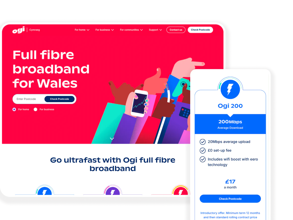
Ogi is Wales’s leading full-service telecoms company, on a mission to bring gigabit-capable connectivity to homes and businesses across south Wales. Based in Cardiff, they’re a proudly Welsh business with a strong sense of purpose; building ultrafast infrastructure that communities can rely on.
Their website isn’t just a marketing asset. It’s a live sales and service environment, simultaneously functioning as a broadband sign-up journey, a product comparison tool, a community information hub, and a customer support platform. For a business growing at Ogi’s pace, that’s a lot to ask of a single digital presence.
A site that has grown fast
Ogi’s website has evolved considerably since launch. In the early days, its primary job was awareness: letting people know Ogi was coming to their area. As the network expanded and more premises became available, the site needed to shift gear entirely, transitioning into something closer to an e-commerce experience while retaining its role as a brochure and information resource.
Hannah Murray, Senior MarTech Executive at Ogi, describes it plainly: the site is their 24/7 shop window, and they needed it to work as hard as possible.
The challenge wasn’t that the site was broken. It was that a website in constant motion, with teams making regular changes to products, offers, campaigns, and content, naturally accumulates small inconsistencies and friction points over time. When you’re deep in the work, updating things day to day, those details can slip through the net. Simply because familiarity changes what you notice.

“Our website changes constantly, so we thought it would be valuable to bring in an outside expert with fresh eyes – not just to review how the site looks or how it’s structured, but to understand what customers actually do when they’re presented with a choice, how they interact with the different elements, and how we get them from A to B as seamlessly as possible.”
Why Illustrate Digital
Ogi came to us because we were the right combination of local and specialist. Being based in Cardiff mattered; Ogi are a Welsh business with a strong sense of place, and working with a team that understood the landscape they operate in was important to them. But local proximity alone wouldn’t have been enough. They needed a team with strong UX expertise and a structured methodology, not just a fresh opinion.
“We knew Illustrate Digital as the local experts,” Hannah says, “and where we can, we want to work with people in Wales, just around the corner from us. But we also knew the team had the approach we were looking for – to come in with fresh eyes and give us actionable insights.”
What the audit covered
The scope was deliberately holistic. Rather than a narrow review of a single page or user journey, Ogi wanted a complete picture, and that’s what we built. The work encompassed four distinct workstreams.
Heuristics – The heuristic evaluation assessed the site against established UX principles across the main site, the buying journey, and overall look, feel, and content, organised and prioritised so that Ogi always knew both what needed attention and why.
Behavioural – We analysed Hotjar behavioural data to understand how real users were actually moving through the site: where they hesitated, where they dropped off, and where the experience was quietly working against them.
Analytics – Google Analytics provided the quantitative layer, adding further context to the behavioural patterns the Hotjar data surfaced.
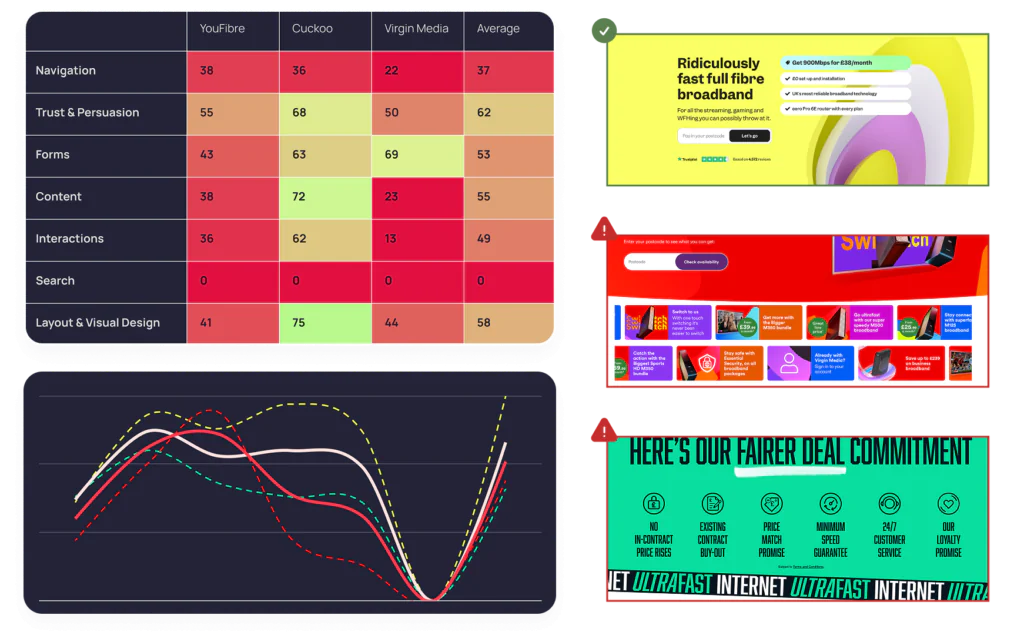
Competition – Finally, competitor benchmarking placed Ogi’s experience in the context of the wider market, measuring them against providers ranging from the major national players down to more local alternatives.
The findings were delivered as a structured report in Figma, accompanied by a prioritised roadmap in Google Sheets, giving Ogi a clear view of both the reasoning behind each recommendation and the order in which to tackle it.
What we found, and what changed
Some of the findings confirmed things Ogi had already sensed. Others were exactly the kind of detail that’s easy to overlook when you’re focused on bigger changes.
Hover states and interactive indicators had become inconsistent across the site. External links weren’t always clearly signposted. Form error states were unclear enough that users were submitting incomplete entries. Each of these is the sort of thing that feels minor in isolation. Together, and at the point of purchase, they add up.
“When you’re making big changes,” Hannah reflects, “the smaller details can slip – but the team at Illustrate raised this and put them high in the hierarchy of changes, and that made us rethink our approach – so now, whenever we make changes, we keep that front of mind.”
The competitor benchmarking added a different kind of value, one that Hannah found particularly motivating. Seeing exactly how Ogi measured against the market, both where they were behind and where they were already performing well, created a clear sense of priority without feeling out of touch.
“Seeing how we benchmarked against competitors, big and small, gave us the urgency to make improvements where we could, especially the quick wins. And it was very positive to see where we benchmarked well.”
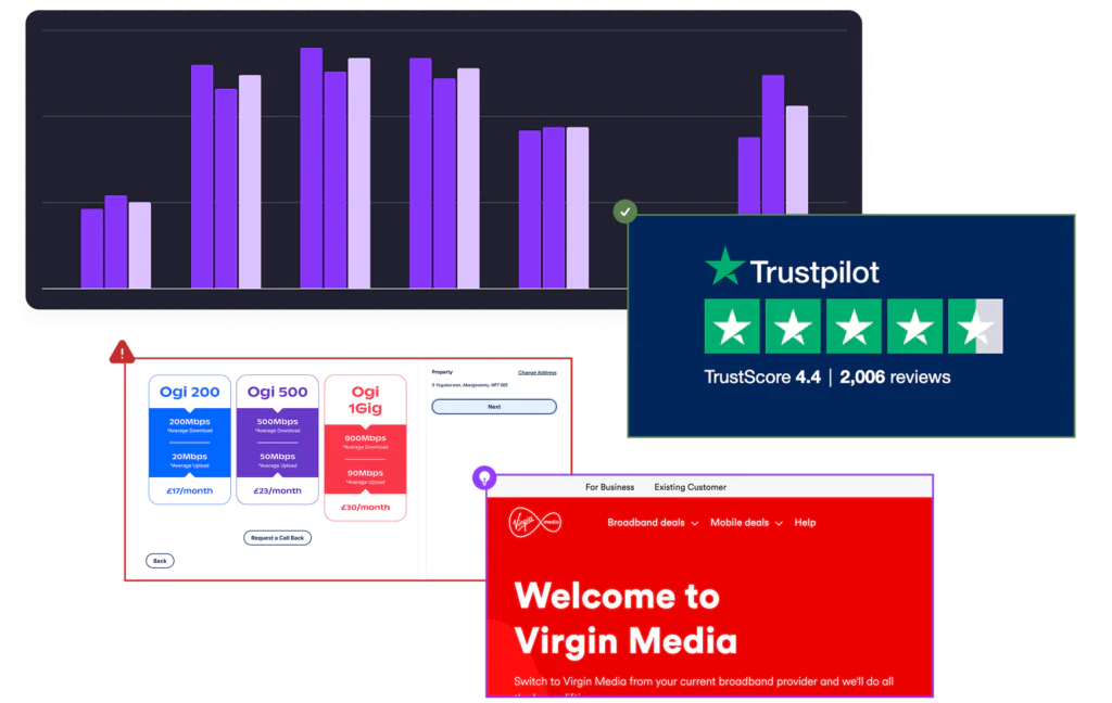
One recommendation had an impact that went beyond the website altogether. We advised Ogi to standardise the visual presentation of their product range, moving away from distinct colours for each product and instead using a consistent red palette with the product features themselves as the differentiator. Ogi implemented the change online, and then carried it through into their print materials as well. A UX audit recommendation that reshaped how they present their products across every customer-facing channel.
The value of evidence
One of the things Hannah returns to more than once is not what the audit found, but how it was framed. Every recommendation was accompanied by an explanation of why the change mattered and what the likely impact on the end user would be. That detail turned out to be as valuable internally as the findings themselves.
“The team didn’t just tell us what needed to change – you told us why, and how it would affect the end user. That was really helpful when communicating with wider stakeholders across the business who might not know much about UX, because we could put it in business terms.”
This is one of the quieter but more significant things a well-structured UX audit can help with. It doesn’t just surface improvements; it gives the people responsible for those improvements the language and the evidence to get them through the business. Hannah could take a recommendation about form error states and explain it in terms of conversion risk and drop-off, or take the competitor benchmarking and present it in a commercial context. The audit has become a resource for internal advocacy, not just a technical checklist.
A blueprint, not a one-off
The most telling measure of whether a piece of consultancy work has genuinely landed is whether it changes how someone thinks, not just what they do. By that measure, this audit has had a lasting effect.
Hannah describes the heuristic framework almost as something she carries around with her now. When Ogi is testing a new feature, or evaluating how a campaign landing page is working, she finds herself running through the same mental checklist: is it obvious to the user what they need to do? Is it obvious if they’ve missed a field? Do they even know they’re about to click a button?
“It’s not just looking backwards at what we can do to an already live site,” says Hannah. “Now, when we’re developing new solutions and products, we apply the same strategies. It’s reshaped how I think about user testing. It’s become almost a blueprint for what we’re looking out for.”
That shift, from audit as a one-time diagnostic to audit as an embedded way of working, is what good UX consultancy should produce. Ogi’s site will keep evolving. Their product range will grow. Campaigns will come and go. But the principles that came out of the audit are now part of how Hannah and her team evaluate every change they make.
“With it being our shop window 24/7,” Hannah adds, “we always want it to work as hard as it possibly can.”
Could this be the start of a great new agency relationship?
Explore similar case studies
Burges Salmon —
building a client-led legal experience
Learn about how Illustrate Digital built and maintains a dynamic, client-led legal experience for one of the UK’s top 50 law firms using the WordPress CMS.
Read Case Study
Bannau Brycheiniog —
Discovering the voice of the Brecon Beacons
Join us on our mission to understand the genuine needs, desires and frustrations of the diverse stakeholders of Bannau Brycheiniog.
Read Case Study
Business Wales —
Evolving UX to support Welsh businesses
Discover how we audited, researched and refined the user journeys and overall user experience for Wales’ free business advice service.
Read Case StudyUnderstand your users with Illustrate Digital
Benefit from the multiple tools and frameworks, alongside our team’s experience in researching planning great UX and user journeys.
View more case studies