


The client
Pure Property Finance is one of three related specialist finance brands under the Pure Advisory Group, alongside Pure Structured Finance and Pure Wealth Management. Between them they cover a wide spread of specialist lending and advice: bridging loans, development finance, commercial and buy-to-let mortgages, secured loans, and insurance through Pure Property Finance; large-scale structured commercial finance (from £6m acquisitions to £18m portfolio refinances) through Pure Structured Finance; and independent pensions, investment, tax and estate planning advice through Pure Wealth Management.
All three operate as regulated financial services businesses. Pure Property Finance and Pure Structured Finance are authorised and regulated by the FCA as credit brokers rather than lenders, working across dozens of funding partners (60+ lenders for property finance, 200+ for structured commercial finance) to place bespoke deals. Pure Wealth Management is separately FCA-authorised for independent financial advice. That regulatory backdrop, and the fact that a credit broker’s commission model has to be disclosed transparently to every customer, meant trust wasn’t a nice-to-have for any of these sites. It was the product.
Where things stood
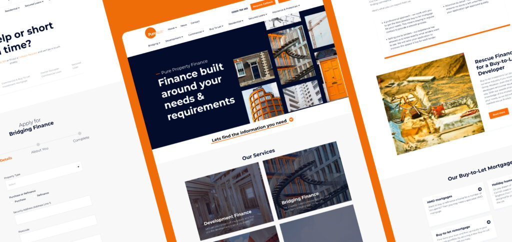
Three related brands, three overlapping but distinct audiences, and (per the live page’s original framing) years of accumulated customer and user interaction data that wasn’t being put to work. The task wasn’t to invent a strategy from a blank page; it was to translate real behavioural insight into sites that could do two jobs at once: serve existing customers and introducers who wanted fast, specific answers, and win over newcomers who’d never trusted a specialist lender with sensitive financial information before.

What we did
Across all three sites, the brief was consistent: prioritise quick information, build confidence, and generate leads. A site built purely for speed of information can feel thin and untrustworthy. A site built purely to build confidence can bury the answer a visitor actually came for.
Getting both right, for three different audiences, meant:
Clear service architecture
Built around how people actually search for specialist finance (by product type, by borrower situation, by loan size) rather than how the business is organised internally. Pure Property Finance’s site alone spans bridging, development, commercial, residential, secured loans and insurance, each with its own dedicated pages rather than one generic “finance” page trying to serve everyone.
Trust signals built in
Press mentions (The Guardian, Financial Times, This is Money), lender network numbers, and clear regulatory information, all surfaced early rather than buried in a footer, which matters when the visitor’s next step involves handing over sensitive financial detail.
Content library and case studies
A format built to do real work: specific, numbers-led case studies (an £18m portfolio refinance, a £6m hotel chain acquisition) that let prospects see themselves in a real, similar situation rather than reading generic marketing copy.
Application and enquiry journeys
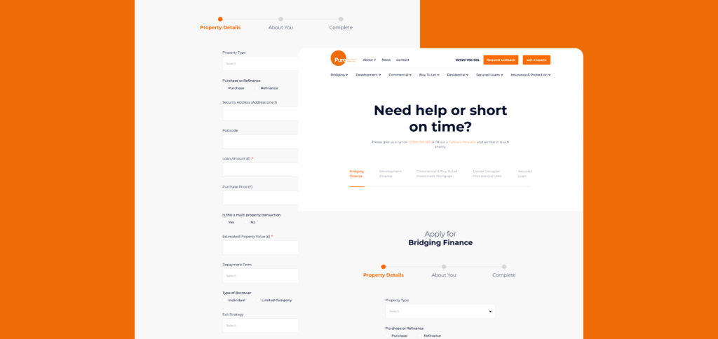
Specifically designed around convincing someone to share sensitive financial information with a credit broker they’ve never worked with before, and being transparent about how that broker gets paid in the process.
The results
The research-first approach, carried out in collaboration with Liberty Marketing, gave the project a proper run-up: a firm footing for site architecture built on usability and accessibility as core pillars rather than afterthoughts.
The key challenge throughout was retaining and nurturing new traffic, people who’d never dealt with a specialist lender before and had no existing reason to trust one. We addressed that by designing a more intuitive user journey, streamlining the value propositions on offer, and building in clearer site authority indicators, the press mentions, lender numbers and regulatory transparency that a first-time visitor needs to see before they’ll consider sharing financial information.
Beyond the resulting rise in time-on-site and enquiries, that work showed up across the site in several concrete ways.
- Mobile navigation, accessibility and overall trustability all improved together, rather than one coming at the expense of another.
- Self-help content was reorganised so new visitors could resolve their own questions and build confidence before ever picking up the phone.
- The product and service proposition was clarified throughout, cutting the friction that had been costing the site engaged visitors.
- And the application forms themselves were rebuilt with UX signals specifically designed to encourage prospects to hand over lead data, recognising that for a credit broker, the form is the moment trust either holds or breaks.