Over the last few years, The United States Government has been focused on reducing their trade deficit by increasing America’s export contributions. And, in February 2024, they were able to reduce it to the lowest amount in 3 years.
And, there’s a hidden hero behind all of this growth: the AWTCC.
Led by Brian Smith, a veteran of business both stateside and here “across the pond”, the American World Trade Chamber of Commerce is laser-focused on one thing: empowering export companies and freight forwarders.

They provide Certifications and expert reviews of key documentation to help companies get their products to the international market as quickly as possible.
As the only International Chamber of Commerce (ICC) recognised organisation in America, they’re able to reduce barriers by reviewing, approving, and certifying documents in accordance with international regulations. This makes navigating the tricky, legalese-laden process much easier.
They’ve worked with some of America’s biggest brands to help them get their documentation in order, and have a truly global impact.

However…
Going into 2023, the AWTCC faced a problem. As part of this push for growth, more and more people were coming to them for help. But, their website wasn’t cutting it.
Complex Website, Basic Content Management
I’m sure Brian won’t mind me saying that:
It was a bit of a shock to find such an important website had been built on a very basic content management system — a popular drag-and-drop website builder.
They’d taken this approach – as many companies often do – because they needed a simple solution that made content management easier. The goal was to get their content online, in a way that was easy to manage and (hopefully) for their users to navigate.
The result was a site that looked, felt, and navigated with the same aesthetic and experience you might find actually visiting a government building in person.

Though their Certifications were up 16.5% heading into 2023, the bulk of the feedback they’d received was that the process wasn’t enjoyable or intuitive.
The problem with website builders like Wix and Squarespace is that, while they’re great for SMBs that mostly need a Landing Page, they can’t cope with the infrastructure needed for a complex customer journey.
This creates issues for both:
- Content teams: because, even though uploading a page remains simple, linking pages and content in a way that feels intuitive becomes more complex the more content you add to the site
- End users: because it’s easy to find yourself overwhelmed and lost in the process of finding the website content you really need
And, there was a lot of content and user journeys to try and navigate. Every business that comes to the AWTCC site has different needs and a potentially different outcome.
This led Brian and the AWTCC team to the realisation that there must be an easier way to manage content and get their end users to find it.
Complex Journeys, Complex Solutions?
Brian and the team found themselves in a position not many of us do.
Because of the uniqueness of what they do, they don’t really have any competitors to compare themselves to. There isn’t another type of AWTCC that they could benchmark themselves against.
They could only look at other Chambers of Commerce around the world (many of whom have the same issues), or at professional services sites to get ideas. All of which looked and felt pretty complex.
Brian and the team could only see one way through this problem: they needed to create 3 different websites. One catering to each of their target audiences
- Exporters
- Freight Forwarders
- Chambers of Commerce
It seemed like the only logical way for them to get all of their content online, in a way that was both easy to manage and navigate. Or, at least that’s how it seemed from the outside.

When Brian and his team proposed this to us, we were able to show them that what might seem like a simple solution, would actually create a logistical and financial nightmare. One that would have:
- Increased the costs of building a website (3 sites is more expensive than one!)
- Increase the costs of hosting, by paying for multiple sites
- Meant uploading duplicate content to multiple sites, with only minor variations
- Reduced the ability to rank in search engines or on other marketing channels
And, most likely, it would have created the same problem, just at scale. Instead of struggling to find the right webpage, their end users might have struggled to find the correct website!
We suggested that they should focus on creating one website that had 3 distinct user journeys. And, that WordPress should be the content management system they use to do it.
Starting With The End In Mind
The user experience methodology used to create the structure of their website involved starting with the outcomes in mind:
- What has the user come here to do?
- How can we get them there with the least amount of frustration?
Answering these questions – along with understanding Heuristics and UI Design – makes building a user experience from scratch much easier.
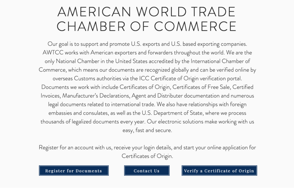
Their homepage now asks one pertinent question, that funnels users into the right content within one click of opening the homepage:

Once they’re in the correct ‘channel’ all of the issues they can address are displayed on the page with a clear description.
This allows people to know whether they’re in the right place, or if they need to go back to the homepage, almost immediately.

If they feel that they are in the right place, they can pick from a limited number of relevant options with clear calls to action.
This means the entire journey from landing on the AWTCC page, through to finding the right information, has been reduced to a small number of clicks.

As a result of this simplified user journey, AWTCC have increased their certifications 20% year on year.
‘Export’-Ing Their Site To WordPress
WordPress plays a key role in building a website this way, and empowering AWTCC to add content to their site over time.
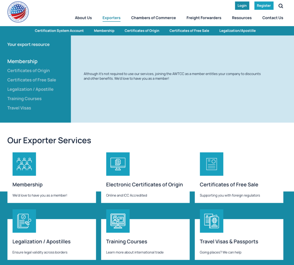
WordPress’s page builder provides a familiar block-builder style that allows them to quickly put content pages together in a way that reduces complexity and frustration for their content team.
They can save templates and specific blocks – like calls to action – that make building out the sites much easier and more intuitive than their mainstream drag-and-drop builder. Making for a much better experience, both for the person building the page and the one interacting with it.
You can see below that the “blocks” for these 2 pages are variations of each other, which are simple and easy to build using pre-saved templates:

It’s intuitive and creator friendly elements like this that make WordPress such a great choice for content-driven websites like this one.
Wrapping This Up…
The AWTCC is a stellar organisation doing great work. And, they were one of our favourite clients to work with recently. It’s clear they have a vision of what America’s export economy looks like, and they want to empower businesses to be a part of it with the least amount of frustration.
That sounds like a message we can get behind.
If you want to learn more about Illustrate Digital’s work on the AWTCC site, you can check out our case study here. Or, click the banner below to get in touch!


